2 Tiny Improvement Ideas for gojek.com Website


I spent last weekend rewriting a better part of gojek.com -- my clone. The initial idea was to replicate the original by assembling image and font file assets. I wanted to exercise layouting without designing first. It has added hours of HTML/CSS/JS work to me.
Without necessarily saying that the original is bad, I found myself coming up with better ideas on some details. I am writing this blog to share some of them.
So hear me out, my tiny visual modification that I think will improve gojek.com:
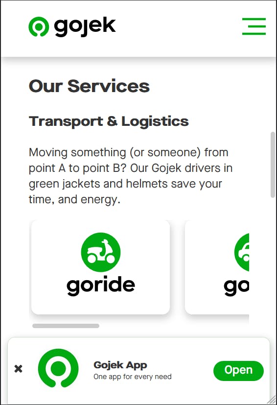
Horizontal Scroll: Mobile experience has spoiled us
Points:
- We swipe in mobile to interact with components like this. Naturally, I also tried to scroll in desktop. I wasn't surprised, but still disappointed.
- CSS provides convenient property
overflow-x: scroll. It's free.
Underline Animation: Simpler implementation
Points:
- "Underline ends where link text ends" is easy to code.
- "Using
:afterpseudo-class, insert underline ascontent", not so easy. - Ending at tip of arrow is easier to reason than at somewhere between text and arrow.
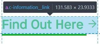 Line begins at 'F', so either it ends at 'e' or at tip of arrow.
Turns out it looks terrible without actual icon component (I prepared the codepens after the app is done).
 How it looks in context.
A few notes in defense of original website. Software development takes up whatever time you give them, there is always something to improve!
Gojek design is a very good standard by all means, which is why improving their website is worth attempting at all. Also, I haven't considered browsers other than my phone/laptop's, which means the properties (overflow-x, etc) may not behave, look, or perform as expected. Basically I have skipped testing, the most important requirement of shipping software.
Otherwise, I hope this blog post gets my message across. Let me know what you think!